In today’s digital-first world, having a website that works seamlessly across devices isn’t a luxury—it’s a necessity. Whether you’re a web developer, digital agency, or a business owner working with a tech partner, choosing the right web design approach can dramatically affect performance, user experience (UX), and SEO.
Two popular methods—Responsive Design and Adaptive Design—often spark debates among professionals. Both aim to optimize the user’s experience across different devices, but they differ fundamentally in execution and flexibility.
At Shark Digital, we specialize in crafting high-performance websites tailored to the unique needs of our clients. In this comprehensive guide, we’ll break down the core differences, pros, and cons of responsive vs. adaptive design—and help you determine which is the best fit for your project.
Introduction: Why Design Approach Matters
Your website’s design directly affects:
- User Experience (UX): How easily users interact with your site across devices.
- Search Engine Optimization (SEO): Google prioritizes mobile-friendly design.
- Performance: Faster load times improve rankings and conversions.
With mobile traffic now accounting for over 60% of all web usage globally, ensuring your website adapts effectively to screens of all sizes is essential.
Let’s explore how responsive and adaptive design stack up.
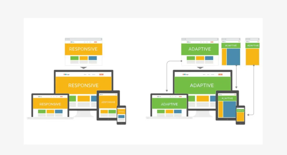
What Is Responsive Design?

Responsive Design uses fluid grids, flexible images, and CSS media queries to automatically adjust the layout based on the user’s screen size.
How It Works:
- A single HTML file with CSS rules that adapt to the device’s screen width.
- Layouts are built with percentages instead of fixed units.
- Media queries trigger layout changes at defined breakpoints.
Pros of Responsive Design
- Single Codebase: One layout adapts across all devices, reducing development and maintenance costs.
- SEO-Friendly: Google recommends responsive design for mobile-friendliness and crawling simplicity.
- Easier Maintenance: Fewer templates and consistent styling make updates faster.
- Dynamic Layouts: Content flows naturally, improving user engagement.
Cons of Responsive Design
- Performance Trade-Offs: On high-performance sites or complex UIs, it may load unnecessary elements, affecting load time.
- Less Design Control: Specific layout control for each device is limited compared to adaptive methods.
What Is Adaptive Design?
Adaptive Design uses predefined layouts tailored for specific screen sizes and devices. Rather than one fluid layout, it delivers multiple fixed layouts, loading the one that best matches the device.
How It Works:
- Detects the device type (e.g., phone, tablet, desktop) on the server or client side.
- Loads the appropriate version of the site (e.g., 320px, 768px, 1024px layouts).
- Focuses on optimizing the design per device rather than scaling fluidly.
Pros of Adaptive Design
- Highly Optimized Performance: Loads only what’s necessary for each device, improving speed.
- Precise UX Control: Designers can tailor layouts specifically for each screen size.
- Better for App-Like Interfaces: Ideal for complex, interactive web apps with specific workflows.
Cons of Adaptive Design
- More Development Time & Cost: Requires multiple layout versions and more complex coding.
- Higher Maintenance: Updates must be applied across all layout versions.
- SEO Challenges: Requires careful implementation to avoid duplicate content or indexing issues.
Key Differences: Responsive vs. Adaptive Design

Which Should You Choose?
The right design approach depends on project scope, target audience, performance needs, and budget.
Responsive Design Is Ideal For
- Blogs, corporate websites, service-based businesses.
- Projects with limited budgets or tight timelines.
- Sites with predominantly content-focused pages.
- Those prioritizing SEO and mobile-friendliness.
Adaptive Design Is Ideal For
- Complex web applications.
- Sites that demand optimized performance for different device types.
- Projects where user experience needs precision.
- Brands with large budgets and dedicated dev teams.
Hybrid Approach (Responsive + Adaptive):
Some advanced projects use a responsive base with adaptive enhancements—like device-specific images or components. This offers flexibility while maintaining performance.
Shark Digital’s Recommendation
At Shark Digital, we don’t believe in one-size-fits-all solutions. Here’s how we approach web development:
For most clients, we recommend responsive design due to its SEO advantages, scalability, and lower maintenance.
For clients launching complex platforms or high-conversion eCommerce apps, we lean toward adaptive or hybrid solutions that optimize every pixel of the user journey.
Our web development experts assess your specific goals, audience devices, and performance requirements before suggesting the best-fit solution.
Future-Proofing Your Design Strategy
Whether you go responsive, adaptive, or hybrid, here’s what’s non-negotiable in 2025:
Mobile-First Indexing
Google now ranks websites based on the mobile version first. A non-mobile-friendly site can tank your search visibility.
Core Web Vitals
Google’s Core Web Vitals focus on loading speed, interactivity, and visual stability. Your layout strategy should complement these metrics.
Accessibility (WCAG)
Both design approaches must consider accessibility for compliance and inclusivity.
Security & Performance
Design choices impact performance and loading—affecting everything from bounce rates to conversions. Tools like lazy loading, minified scripts, and CDN delivery must be integrated into both responsive and adaptive workflows.
Real-World Example:
A Shark Digital client, a national wellness brand, saw a 40% decrease in bounce rate and 22% increase in conversions after switching from an outdated fixed design to a responsive framework optimized for Core Web Vitals.
Conclusion
Choosing between responsive and adaptive design is more than just a technical decision—it’s a strategic one.
Still Unsure?
Shark Digital’s web development team can help you evaluate your business goals, user data, and performance metrics to determine the best design approach.
Contact us today for a free consultation and expert guidance on building a website that performs, ranks, and converts.